Many times when you want a static home page you don't want to see the sidebar widgets. You probably noticed that on my test site for the Static Home Page I was able to hide the sidebar that you normally see on you layout in the blog posting page. Removing this is a simple trick and just requires some basic CSS and Blogger template code to adjust.
The key to doing this is to simply use CSS to hide, or, display:none on your sidebars and then adjust the width of your page to fit your design needs.
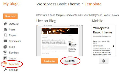
First step is to just into your Blogger template editor and then choose the 'Edit HTML' button like this:
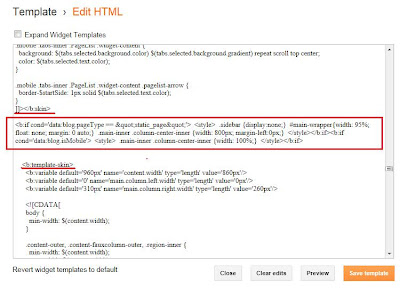
Click the 'Proceed' button to jump into your template. You don't have to worry about 'Expand Widget Templates' here because we're only working within the CSS section. Seach for the part of your template that has the keyword ]]></b:skin> like this:
You can see the section I've highlighted in my circled region - plus, I've shown about how far down in the template you need to go to find it.
What we're going to do is add some simple template code between the ]]></b:skin> line and the <b:template-skin> line. What you want to pay attention to, however, is the type of template you have - is the sidebar on the right, left or both sides?? Now, this code will only affect your static pages and not the main blog posting page. To test this you'll need to have a static page created ahead of time. We'll come to that in a bit.
Next, copy this code below right between the circled lines above:
If you've noticed - I've highlighted two parts in this code - the width: and the margin-left:. This code right now is only setup for a right sidebar. The pasted code should look like this:
Remember, you'll need a static page to test so your Preview button will only tell you if the pasted code works - you won't see it visually until you navigate to a static page. The key adjustments you'll want to make are now the margin-left and width values I highlighted in the code.
IMPORTANT:
1. If your blog has a right sidebar, then only adjust the width: value to your proper size.
2. If your blog has a left sidebar, then adjust the margin-left: to a negative value depending on your template - such as -200px or -300px. Then adjust your width: value.
3. If your blog has both sidebars do the same as #2 but just reduce the value for margin-left:.
Press the 'Save template' button to save and test your static pages. You'll have to do some trial and error to get the values just right. I know you could use the tempate values of content.width, etc. but many templates are different and you may find that some don't have the standard template variables so fixed values work better for me. One other note - if you noticed, the mobile template must be adjusted as well so as not to have a full fixed content width. Otherwise, it extends too far to the right on a mobile device.
That's it! You're done. All of your static pages will now have full widths across the width of your blog. Enjoy!
First step is to just into your Blogger template editor and then choose the 'Edit HTML' button like this:
Click the 'Proceed' button to jump into your template. You don't have to worry about 'Expand Widget Templates' here because we're only working within the CSS section. Seach for the part of your template that has the keyword ]]></b:skin> like this:
You can see the section I've highlighted in my circled region - plus, I've shown about how far down in the template you need to go to find it.
What we're going to do is add some simple template code between the ]]></b:skin> line and the <b:template-skin> line. What you want to pay attention to, however, is the type of template you have - is the sidebar on the right, left or both sides?? Now, this code will only affect your static pages and not the main blog posting page. To test this you'll need to have a static page created ahead of time. We'll come to that in a bit.
Next, copy this code below right between the circled lines above:
<b:if cond='data:blog.pageType == "static_page"'>
<style>
.sidebar {display:none;}
#main-wrapper{width: 95%; float: none; margin: 0 auto;}
.main-inner .column-center-inner {width: 900px;margin-left: 0px;}
</style>
</b:if>
<b:if cond='data:blog.isMobile'>
<style>
.main-inner .column-center-inner {width: 100%;}
</style>
</b:if>
If you've noticed - I've highlighted two parts in this code - the width: and the margin-left:. This code right now is only setup for a right sidebar. The pasted code should look like this:
Remember, you'll need a static page to test so your Preview button will only tell you if the pasted code works - you won't see it visually until you navigate to a static page. The key adjustments you'll want to make are now the margin-left and width values I highlighted in the code.
IMPORTANT:
1. If your blog has a right sidebar, then only adjust the width: value to your proper size.
2. If your blog has a left sidebar, then adjust the margin-left: to a negative value depending on your template - such as -200px or -300px. Then adjust your width: value.
3. If your blog has both sidebars do the same as #2 but just reduce the value for margin-left:.
Press the 'Save template' button to save and test your static pages. You'll have to do some trial and error to get the values just right. I know you could use the tempate values of content.width, etc. but many templates are different and you may find that some don't have the standard template variables so fixed values work better for me. One other note - if you noticed, the mobile template must be adjusted as well so as not to have a full fixed content width. Otherwise, it extends too far to the right on a mobile device.
That's it! You're done. All of your static pages will now have full widths across the width of your blog. Enjoy!


This comment has been removed by the author.
ReplyDeleteHi tj,
DeleteYou'll have to go into the Template and attempt to hide each widget depending on which page you want to be the trigger. It's a bit beyond what's explained here - however, if you use this post and the post about customizing your blog post title as a guide you should be able to tackle it.
- Don James
Don James, I have a question. Please help me. I have a blog and I want a page to remove the side bar. This is the page. I hide the widgets but the content has no extend to final. Please see it. Thanks a lot. This is a third party template:
ReplyDeletehttp://www.poemasalacarta.com/2013/01/solicita-un-poema.html
Hi Ayra!
DeleteSorry about the delay - I was out of town. It looks like you've solved the problem. I see the page spans all the way across. Did it work out for you??
Let me know if I can help.
- Don
your post always helpfuly. But i want to ask you. I using simple blogger template. im using 3 coulumn, i want to move left sidebar to right post area. if we can se post>sidebar1>sidebar2. can you help me?
ReplyDeleteHi Ahmad,
DeleteYou should be able to go into the Customize - Blog Template Designer - Layout and alter the Body Layout so that you have 3 columns with posts on the left and 2 sidebars on the right. Try that first and let me know if it works.
- Don
Wow, what a helpful tutorial! Thank you so much!
ReplyDeleteHi Cammie!
DeleteGlad it helped you!
- Don
Very helpful tutorial for a non-html new blogger to follow! Thanks!!
ReplyDeleteLove the tutorial!! It worked well for my blog, however I still see the line from where the sidebar started... How do I remove that? Thank you overall, great site!
ReplyDeleteHi itsnkenge!
DeleteGlad you liked it! Sometimes the template you use can be the issue. You might find that you have to alter the CSS code to hide a frame, shadow or line. If you send you blog test site to me I can take a look.
Take care!
- Don
I'm having the same problem- I have a custom design (old) with side bar lines. I removed the gadgets but I can't figure out how to remove the line. Can you help point me to what to look for in code?
DeleteMeghan, what is your template name? Also, can you provide a link to your blog?
DeleteThanks, Don
Hi Don James.
ReplyDeletei have one question . i using new interface template .i follow all your step but i cannot find the proceeds button . Help me please !
Hi goku,
DeleteThe Blogger Template Editor changed recently - so the 'Proceed' button is no longer there. When you press the 'Edit HTML' button you're now taken directly into the Editor. You might have to expand the Template by clicking on the small black triangles to see the CSS section.
- Don
Thank you so much! I am a newbie in blogging but your tutorials are very clear, helpful and they work! congratulations
ReplyDeletetake care
THANKS! I have been trying to do this the last 30 minutes - yours is the only tutorial that worked!
ReplyDeleteHi,
ReplyDeleteYour blog is very helpful. I am clueless how to remove side bar in my blog site. I removed all the widgets. Now its showing empty(www.lostwild.blogspot.com)). I would like to see my blogs to cover this empty space also.
Thanks it works a lot i'm also a newbie in blogging look at my work at (www.digitalgraphicsstation.blogspot.com) it still constructed you can please provide some geek help so i can achieve the vision and my objective as you can see ti, thanks a lot!!
ReplyDeleteOh my goodness! It worked! Thank you!
ReplyDeleteThanks so much! after reading several posts on this topic, only your solution works correctly!!!
ReplyDeletethis is the only tutorial that's worked for me as well. thank a lot u r a genius
ReplyDeleteMy blog comments doesn't show the content and those that has posted them, like how your is showing, it only shows e.g. (5 Comments)
ReplyDeleteNeed help Urgently!
Sent your feedback to romshillzz@gmail.com
Cool
ReplyDelete